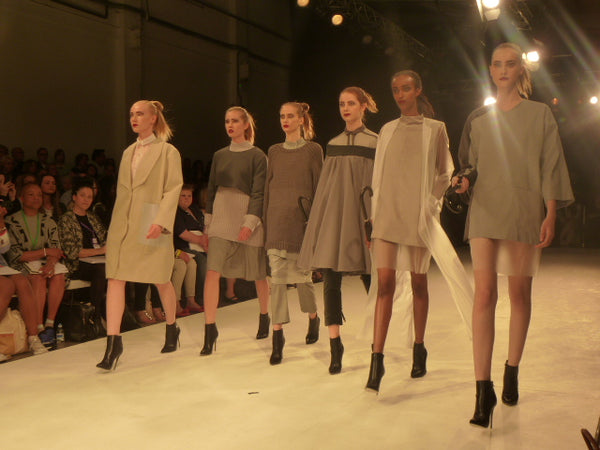
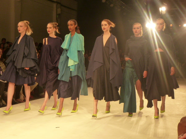
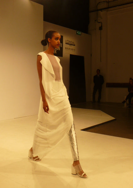
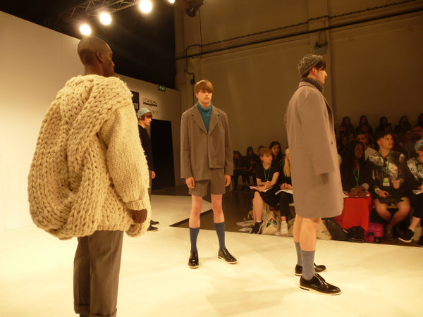
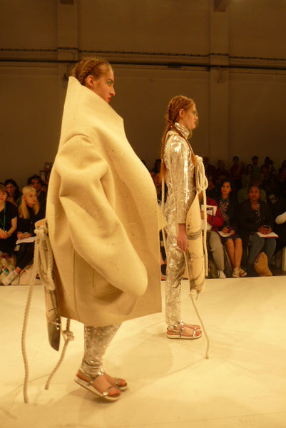
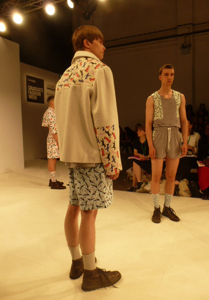
One of the main features of this show is how classical the garments were (with a few exceptions I will mention soon). Kelly Fieldhouse’s and Lauren Basford’s collections were prime of examples of this, well made marketable clothes that don’t cause offence. Some of them, however, did have subtle changes that brought some new dimensions to these classic garments; one example of this is the overcoat designed by Katie Biggs had a panel at the bottom and without any buttons or zips that made this jacket new yet classical and this tension is what attracted me.
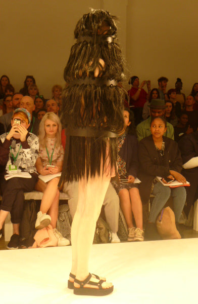
However despite this I was hoping for something more shocking from graduate students. This thankfully came in the form of Sarah Grose and Calum Whitely. Grose’s caged model was obscured by layers of fur. This took most of the audience by surprise and is exactly what I wanted to see. I am impressed with the courage it took to present this in and amongst the classical garments presented by the other designers (as well as the model’s ability to walk in a straight line).
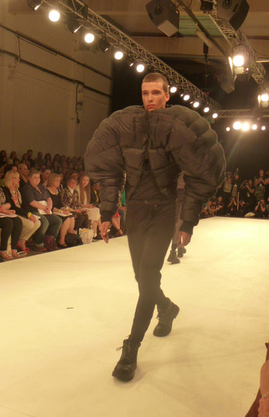
Another student who also made me look twice was Calum Whitely. His ostentatious jackets which engulfed the models with their overstated size accompanied with the dark palette used, to me at least, represented a clever satire of masculinity in an otherwise quite feminine show.
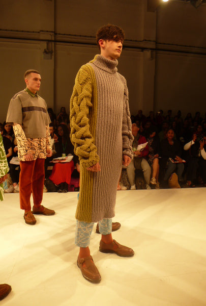
I found that throughout the collections there was a strong use of materials. Most students such as Biggs and Charlotte Illidge demonstrated their ability to create interesting knitwear. Both students created contorting and writhing shapes, Biggs’ at the front and Illidge’s on the sleeves, that presented a pleasing contrast to the flat knitting.
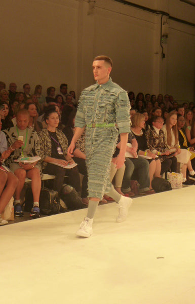
Another student who’s use of materials impressed me was Bethany Bank’s layering of frayed denim to create an almost exoskeleton armour aesthetic that denied the softness of the denim and accentuated its density simultaneously. Above all though it was Elisabeth Kamaris’ use of materials that excited me the most her juxtaposition of a futurist metallic one piece and wood panels at the front. The wooden panels make a clanking sound which for me was very appealing, almost making the garment a multi sensory experience and not just an aesthetic one. Her collection blurred the boundaries of fashion and art, referencing Dadaism and Hugo Ball’s costume in particular when he performed the poem “Karawane”.
With almost all the students at the show there was a sense of play. Sometimes that was made almost explicit with the use of patterns, as with Amanda Humphries’ patterns, that evoked a sense of play rooms and nurseries. The high socks suggested that these were children clothes and the almost patchwork like nature the patterned cloth was applied made me think of mothers mending their children’s clothes after having rough-and-tumbled outside. Alternatively the sense of play was shown through the experimentation with materials and satire. Overall though there was some strong, highly original designers in this show amongst the backdrop of classical safe designs.
Article written by George Toon

