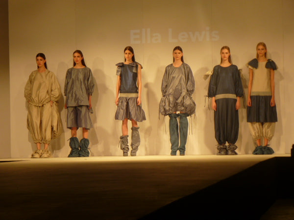
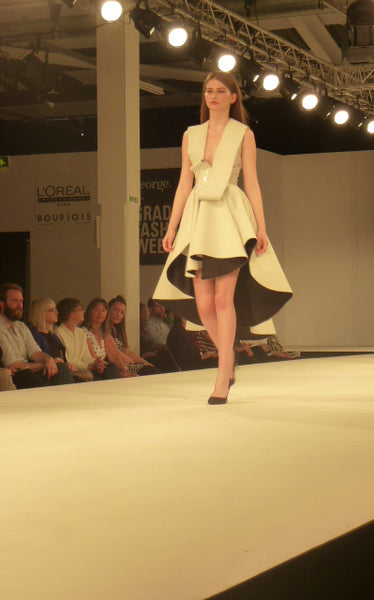
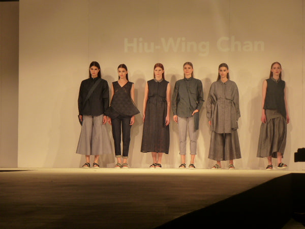
This was one of the biggest shows at Graduate Fashion Week with over 20 students exhibiting. So where to begin? There was variety in terms of materials, colours, approaches... everything really. I found that I was overwhelmed with the amount that was on show but I made sure to pay the last collection as much attention as I did the first. I think it is great that so many students had the opportunity to exhibit their work rather. Due to the vast scale there were no decreeable themes I could possibly comment on, only that they came from the same university and used the same catwalk.
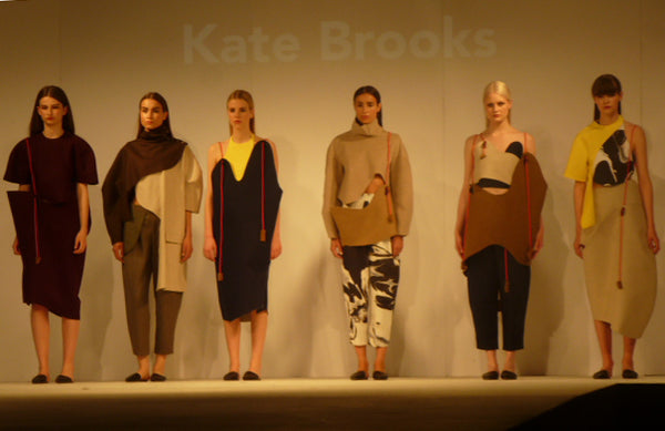
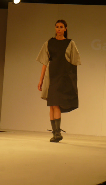
If I were to attempt to find a theme that I liked in some of the collection it would the unusual and interesting shapes used. For example Kate Brooks’ created quite abstract shaped garments, the pieces looked as if they should have been on a Kandinsky painting rather than on clothes. The pieces were attached with pieces of string to the models, pushing the boundaries of what can be considered clothing. Another example of interesting shapes can be seen with one of Gabi Bozyk’s overall pieces which engulfed the models right arm, making it impossible for her to use that arm.
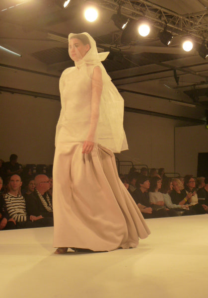
This collection definitely focused on form over function, as many pieces shown on designer catwalks rarely make it to the racks in stores for commercial consumption. In contrast to these modern shapes Emily Bowers-Clarke presented a more classical collection to finish the show, but her draping and wide open pleats made this collection more appealing. The skirts and dresses had a beautiful sense of fluidity and movement. The frills on the jackets again gave a nice contrast to the otherwise safe collection.
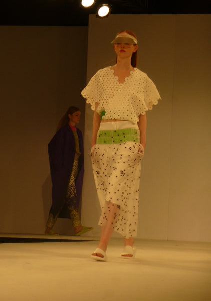
I will also mention one of my favourites from the show. Nataliya Brady’s collection was one of my favourites from the entire week. The bold greens, purples and pinks worked well together against the white, a nice use of bright colours in what at times was a quite monochrome show, so this is what made it stand out. However what impressed me the most about this collection was the patterns. The large circles used for the jackets and shirts made me think of fish or reptile scales, but that in combination with the smaller dots with the skirts, trousers and shorts created a nice contrast. For me it was as if I were looking at the positive and negative spaces of the same pattern simultaneously since the smaller dots were the same size as the negative space within the larger circles.
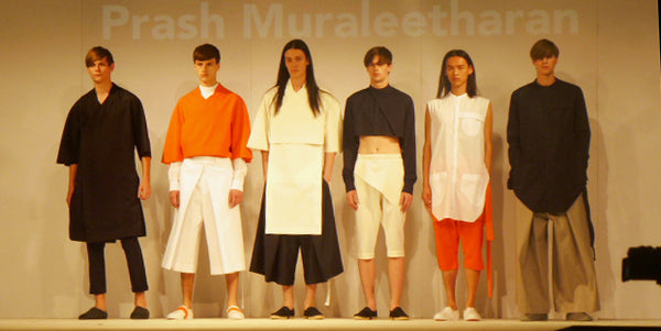
Prash Muraleetharan was another favourite from Brighton. His menswear collection used mainly a monochrome greyscale colour palette with pops of orange to add interest. He chose more minimalist shapes in his designs, yet played with the scale and cuts more commonly seen in womenswear collections.
Written by George Toon

